


SATVYAM was envisioned as a modern nutrition brand rooted in the richness of traditional Indian wellness. In a category dominated by synthetic supplements, exaggerated claims, and overly commercial branding, the challenge was to create a brand that stands for purity, authenticity, and trust — while still appealing to a modern, quality-conscious audience.
SATVYAM
ZERO ADS & CREATIVE COMMUNICATION approached this as a heritage-driven premium branding
project, combining cultural depth with contemporary design sensibilities.
From brand identity and visual language to packaging direction and communication strategy,
every element was crafted to reflect strength, simplicity, and credibility. The goal was to
position SATVYAM not just as a product, but as a philosophy of natural nutrition.
The result is a distinctive brand that communicates clarity, confidence, and cultural
authenticity, standing out as a powerful alternative in the health and nutrition market.
Brand Story
In a world filled with artificial solutions,
true strength often lies in what is natural.
SATVYAM was born from the belief that nutrition does not need to be complicated — it needs
to be pure, honest, and rooted in tradition.
Inspired by the word “Satva”, meaning purity and balance, the brand represents a return to
what truly matters — authentic nourishment that supports real strength.
For generations, Indian households have relied on natural ingredients to build immunity,
energy, and resilience. SATVYAM brings that wisdom into the modern world — not by changing
it, but by presenting it with clarity and purpose.
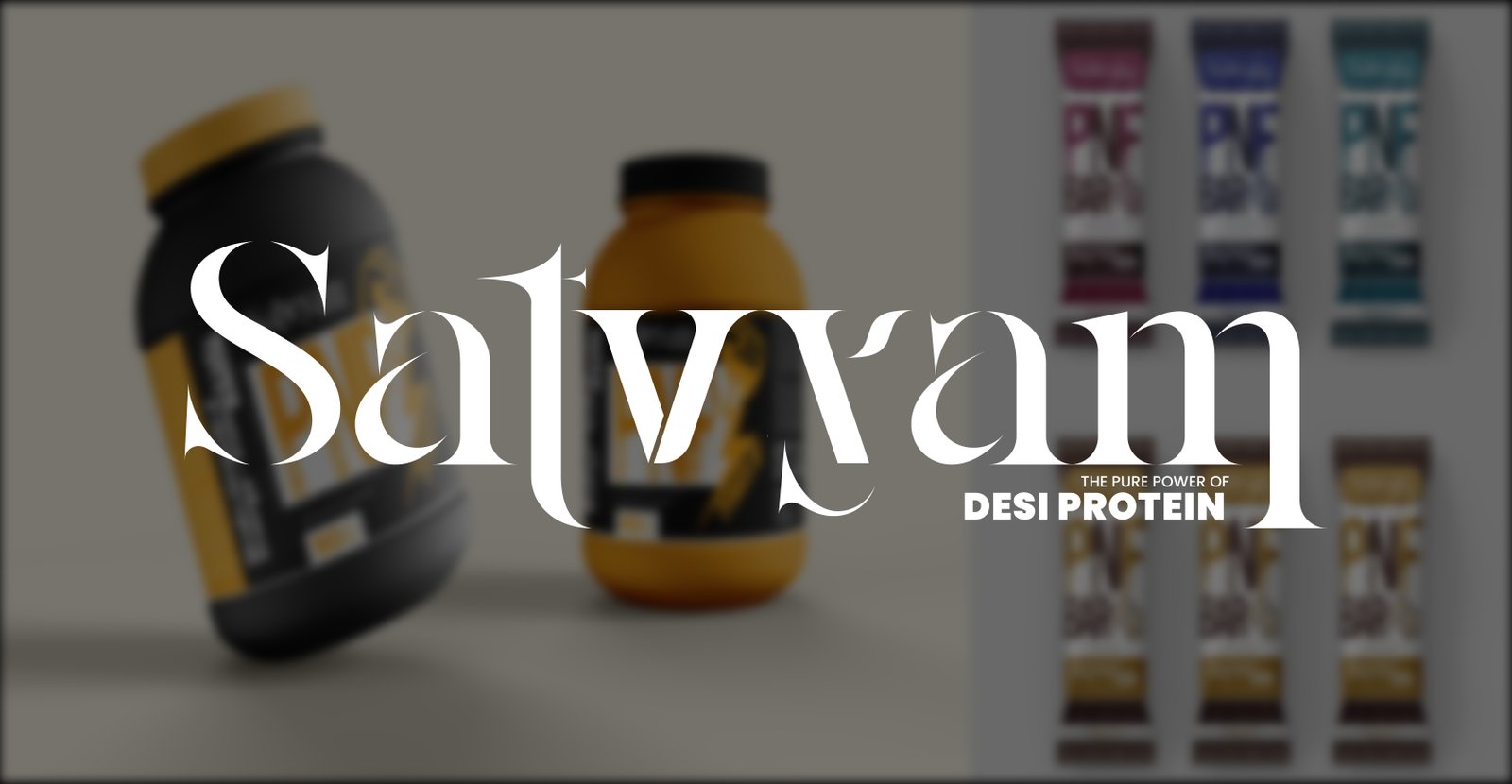
We built the brand around a powerful idea:
“The Pure Power of Desi Protein.”
This became the foundation of the brand’s identity — a statement that blends cultural
authenticity with functional strength.
The visual identity reflects:
• Elegance and refinement through minimal typography
• Strength and richness through gold-accented tones
• Trust and authenticity through a clean, structured design
The communication avoids noise and exaggeration — focusing instead on:
• Purity of ingredients
• Simplicity of message
• Strength of tradition
SATVYAM is not just a product.
It is a reminder that what is natural is powerful —
and what is pure is enough.
The Challenge
• Competing with established, synthetic nutrition brands
• Building trust in a highly skeptical health category
• Making traditional nutrition feel modern and premium
• Avoiding generic “fitness brand” positioning
• Communicating authenticity without appearing outdated
Our Approach
We adopted a purity-led premium branding strategy:
1. Heritage-Driven Positioning
Rooted the brand in Indian tradition while making it relevant for today
2. Premium Visual Identity
Created an elegant and refined design system to enhance perceived value
3. Clear & Honest Communication
Focused on simplicity, avoiding clutter and exaggerated claims
4. Consistency Across Touchpoints
Ensured every visual and message reflects the same tone of trust and strength
Key Deliverables
• Brand identity & logo design
• Visual language (color palette, typography, tone)
• Packaging design direction
• Brand messaging & communication strategy
• Marketing creatives & collaterals
Services Provided
Branding | Creative Direction | Packaging Design | Communication Strategy | Marketing Creatives
Creative Direction
We transformed communication from generic to meaningful:
• From “protein supplement” → to desi nutrition power
• From “fitness-focused messaging” → to holistic wellness
• From “complex claims” → to clear, honest communication
The visual language emphasized:
• Minimalism with elegance
• Premium color tones
• Strong, confident typography
Achievements
💪 Strong premium brand perception
🌿 Clear positioning around purity and authenticity
🎯 Differentiation from synthetic competitors
🛒 Enhanced product appeal and shelf presence
📈 Scalable brand identity for future growth
Conclusion
SATVYAM proves that the future of nutrition lies not in complexity —
but in returning to what is real, pure, and trusted.
By combining tradition with modern branding, we created a brand that doesn’t just compete
—
it stands for something meaningful.
Closing Statement
If your brand is built on authenticity…
we’ll make sure it becomes its greatest strength.
ZERO ADS & CREATIVE COMMUNICATION turns truth into powerful brands.